React Google Chrome Extension for beginners (or not!) — Part I
Why use React to build a Google Chrome Extension?
React is a popular javascript library, presenting several technical advantages.
A Google Chrome Extension (GCE) can be created using javascript and html files only. However, imagine that you want to build a complex GCE with lots of different features and something to be scalable. React may be a good ally in this case, since it allows reusability of components, increases performance and it is developer-friendly both for its learnability and debug tools.
Besides, even if you want to build a more simple GCE but you are already familiar with React and want to take the advantages of this library, it is still a good choice.
What should I know before I get started?
This guide assumes you know the basics of React, however, if you don’t, but want to, I advise you to start by taking a look at the Main concepts section of the React JS official website.
If this is your first time working with Google Chrome Extensions, you must understand how extensions work, which is not typically as a common web app. Hence, I recommend you to explore the official Google Chrome extensions documentation, starting with the Getting Started section, followed by at least the following concepts in the In depth: core concepts section:
Getting started
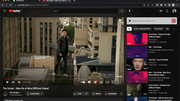
Google Chrome Extensions (GCE) can be an advantageous tool for its handiness around the browser. ⚡ In this tutorial we will be creating a Google Chrome Extension for YouTube, that will allow us to add videos from the YouTube website, to a custom playlist, which can afterwards be easily accessed in the extension popup:
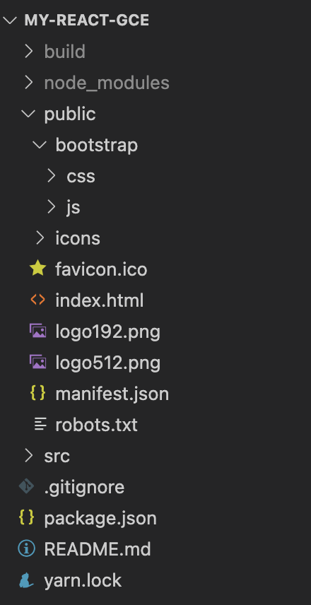
Firstly, we will create a new React project, by running the yarn create react-app my-react-gce command in the desired project directory. My app is running on react v18.2.0 and node v20.1.0and I’m using git for version control (optional). For the next steps, we will be using the VSCode editor, however feel free to choose your favorite one.
Manifest.json file
Firstly, we will update the file under /public/manifest.json, which is typically the first step when creating a GCE. This file contains fields in which we define important information particularly the manifest version, the name of the extension, its version, and the declaration of the popup (you can check for more examples of these UI features here). Please follow the structure described in the Google Chrome Extensions official documentation to create the manifest file. We will be using the current latest version of the manifest (Manifest V3):
{
  "manifest_version": 3,
  "name": "Fun extension",
  "description": "Your custom YouTube Playlist",
  "version": "1.0.0",
  "icons": {
    "256": "/icons/music-logo.png"
  },
  "action": {
    "default_icon": "/icons/music-logo.png",
    "default_popup": "index.html"
  }
}
/public/manifest.json
You can download the /icons folder here, and add it to the root of your /public directory.
Test extension
Now that we updated our manifest.json file with required fields and the popup declaration, let's give it a try and see if it does something:
- Run
yarn buildin your project directory. 💡 TIP - use the VSCode terminal (go toTerminal > New terminal). This step creates abuilddirectory in your project with a production build of your app. - In your Chrome browser, go to the
3 dots > More tools > Extensionsor just go tochrome://extensions/in the Chrome’s Omnibox instead. - Then,
Enable the developer mode > Load unpacked > Choose build folder generated in step 1.
📝 You can refresh the extension code with the Refresh icon anytime you update your code.
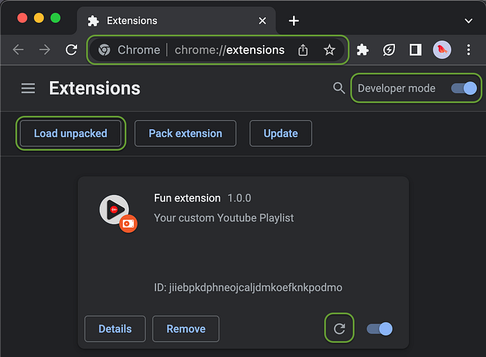
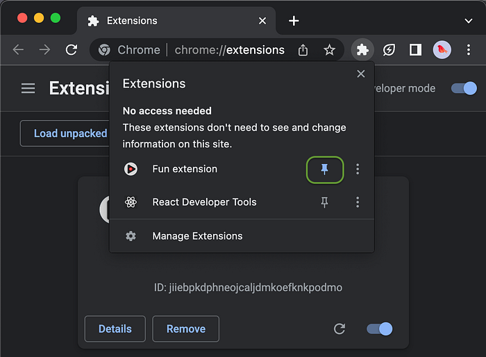
Try it out! 👀 Click in the puzzle piece-shaped icon 🧩 to the right of Chrome’s Omnibox and select the extension. 💡 TIP: Click in the pin icon 📌 to pin the extension for future easy access during this tutorial:
You should see something similar to the image below:
Yeah, I know, it is not an impressive popup, but we’ll change that right away! 🙃
⚠️ For older versions you might get an error in the extension. If that’s the case, don’t worry — I got you! This error is related with the Content Security Policy, as the image below shows:
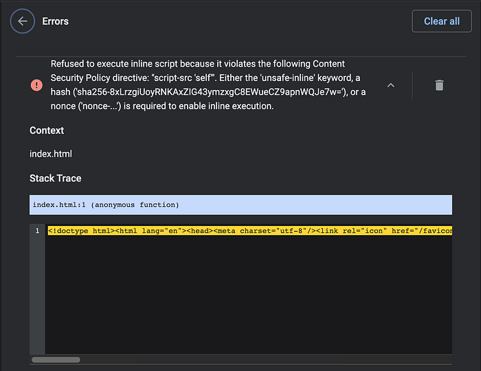
By default, during the production build, Create React App will embed the runtime script into the index.html file (https://create-react-app.dev/docs/advanced-configuration/) which is not viable when dealing with Content Security Policy.
You can solve this issue by adding the INLINE_RUNTIME_CHUNK=false statement to your build command in the package.json file:
...
"scripts": {
    "start": "react-scripts start",
    "build": "INLINE_RUNTIME_CHUNK=false react-scripts build",
    "test": "react-scripts test",
    "eject": "react-scripts eject"
  },
...
package.json
Optionally, you can add the INLINE_RUNTIME_CHUNK=false statement to your .env file instead.
Now, re-run the yarn build command, clear the errors in the extension box, refresh it and give it a second try!
Creating a custom popup
At this point our manifest.json file contains the following code:
...
"action": {
    "default_icon": "/icons/music-logo.png",
    "default_popup": "index.html"
  },
...
This means that our popup code logic lives inside of the index.html file of the extension's directory (or, in other words, in our build folder), and the icon depicted in the popup will correspond to the /icons/music-logo.png image.
Local testing
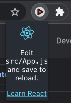
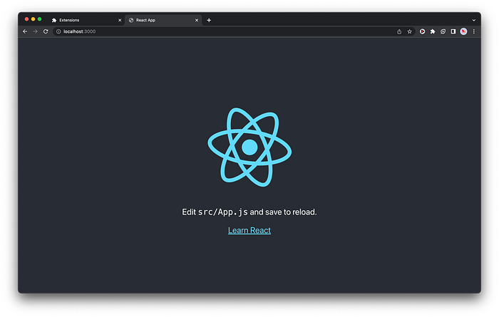
By running the yarn start command in your project directory, you will be able to see the result of the React code in App.js file (default code when the project was generated using the create-app command) which corresponds to the one we saw in the popup user interface:
Testing the popup locally has its benefits, as the browser refreshes the page at the same time the code is updated, and you can also use the React Developer Tools extension for debug purposes.
Adding a custom interface
To start, let’s create some mock data for now, to simulate the playlist in our UI:
export const playlist = [
  {
    name: "Anderson .Paak - Come Down",
    url: "https://www.youtube.com/watch?v=-OqrcUvrbRY",
  },
  {
    name: "Jessie Ware - Please",
    url: "https://www.youtube.com/watch?v=-31FETutIr4",
  },
  {
    name: "Stone Sour - Through Glass",
    url: "https://www.youtube.com/watch?v=GIzDsGyxsQM",
  }
];
src/components/popup/values.js
We will now create the FunPopup component, which will primarily contain a title, the list of links to the playlist (saved in the values.js file), and a footer, corresponding to the following code snippet:
import { playlist } from "./values";

function FunPopup() {
  return (
    <div>
      <div id="fun-header">
        <h1>My YouTube playlist</h1>
      </div>
      <div id="fun-body">
        <ul>
          {playlist.map((video, index) => (
            <li key={index}>
              <a href={video.url} target="_blank" rel="noreferrer">
                {video.name}
              </a>
            </li>
          ))}
        </ul>
      </div>
      <div id="fun-footer">
        React GCE Tutorial 2023
      </div>
    </div>
  );
}
export default FunPopup;
/src/components/popup/index.js
Then, add the following component FunPopup to App.js, and delete the App.css and App.test.js files:
import FunPopup from "./components/popup";

function App() {
  return <FunPopup />;
}

export default App;
At this point, you should see the following in your browser http://localhost:3000:
Next, let’s set the width we want the extension to have. ⚠️ Please note there are width and height restrictions in a Chrome popup — max width is 800px and max height is 600px. We’ll set the height later in the tutorial 🙂
body {
  width: 350px;
...
/src/components/popup/index.js
Now, we can open another terminal > run yarn build > Refresh code in the extension > Try it out!
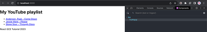
We now have a custom component, but it’s clearly needing some styling!
Current code:
Using Bootstrap for styling
When we want to develop a standard but nice and neat interface without having too much of css work, external libraries such as Bootstrap can be a good ally. However, there are a few things you need to be aware of when using it in a GCE.
If you usually use the jsDelivr by just adding the CDN inline CSS and scripts to your public/index.html file, those styles won't work when you build your extension and test it. This happens because of the content security policies restrictions when using GCE, that basically don't allow the use of external resources.
Note: In version 2 of manifest you can add the "content_security_policy": "script-src 'self' [<https://maxcdn.bootstrapcdn.com>](<https://maxcdn.bootstrapcdn.com/>); object-src 'self';" line to allow that. The same won't work for version 3, as "it disallows certain CSP modifications for extension_pages that were permitted in MV2" (official documentation).
If you still want to use version 3 of the manifest (like I do!), fear not — you still can use the Bootstrap library! Simply download the latest compiled code here and manually add it to your project. In this tutorial I’ll be using version 5.2.3 (bootstrap-5.2.3-dist) by adding it to the public folder, renaming it to bootstrap:
Now, update the public/index.html to include the bootstrap files:
<!DOCTYPE html>
<html lang="en">
  <head>
    ...
    <link href="%PUBLIC_URL%/bootstrap/css/bootstrap.min.css" rel="stylesheet">
    ...
    <title>React GCE App</title>
  </head>
  <body>
    <script src="%PUBLIC_URL%/bootstrap/js/bootstrap.bundle.min.js"></script>
    <div id="root"></div>
    ...
  </body>
</html>Disclaimer: Please note that it is not mandatory that you use an external library to style your interface. In some cases, there is a need to use custom styles, or if you simply like to do CSS by yourself (like I do!) or even improve your styles skills, simply add the needed .css or .scss files like you would normally do in other any React application (ar least for the popup case, since that there are restrictions for other cases like you’ll see in the Part 2 of this tutorial).
Style the popup
We are now ready to make our interface look prettier! Before adding some Bootstrap styles to our popup, let’s firstly create some needed custom styles (using BEM practices) by adding a new CSS file with the following code:
.popup__font {
  font-family: "Verdana", sans-serif;
}

.popup__header {
  background-color: #121212;
  color: white;
  font-size: 15px;
  padding: 10px;
  border-bottom: 3px solid #b22222;
}

.popup__header__icon {
  height: 20px;
  margin-left: 10px;
  opacity: 0.85;
}

.popup__header__icon:hover {
  opacity: 1;
}

.popup__body {
  height: 350px; /* Setting the height of the body - Remember the total height cannot be over the 600px as mentioned above */
  overflow-y: auto;
  background-color: #202020;
  padding: 1rem;
}

.popup__body__list {
  background-color: #3a3b3c;
  color: white;
  width: 100%;
}

.popup__body__logo {
  width: 20px;
  margin-right: 5px;
}

.popup__footer {
  background-color: #121212;
  color: white;
  font-size: 10px;
  padding: 5px;
  border-top: 3px solid #b22222;
}

/* Scroolbar when the playlist overflows the height */
::-webkit-scrollbar-thumb {
  background: white;
  border-radius: 5px;
}
/src/components/popup/index.js
Now, we’ll add the custom and some bootstrap styles, as well as some links and the app logo in the playlist. Hence, we’ll divide the FunPopup component into three: Header, Body and Footer, to keep things more organized:
import "../styles.css";

const Header = () => {
  const rrLogoSrc = process.env.PUBLIC_URL + "/icons/rr-logo-white.svg";
  const githubLogoSrc = process.env.PUBLIC_URL + "/icons/github-logo-white.svg";

  return (
    <div className="popup__header d-flex" id="popup__header">
      <div className="me-auto">My Youtube Playlist</div>
      <div>
        <a
          href="https://revs.runtime-revolution.com/react-google-chrome-extension-for-beginners-or-not-part-i-a5cd6d9f2e40"
          target="_blank"
          rel="noreferrer"
        >
          <img className="popup__header__icon" src={rrLogoSrc} alt="Blog" />
        </a>
        <a
          href="<https://github.com/anamargaridasousa9/my-extension/tree/hooks>"
          target="_blank"
          rel="noreferrer"
        >
          <img className="popup__header__icon" src={githubLogoSrc} alt="Github" />
        </a>
      </div>
    </div>
  );
};

export default Header;
src/components/popup/Header/index.js
import "../styles.css";

const Body = ({ playlist }) => {
  const funLogoSrc = process.env.PUBLIC_URL + "/icons/music-logo.png";

  return (
    <div className="popup__body">
      <div>
        {playlist.map((video, index) => (
          <a
            key={index}
            href={video.url}
            className="popup__body__list text-start btn btn-light mb-1"
            target="_blank"
            rel="noreferrer"
          >
            <img className="popup__body__logo" src={funLogoSrc} alt="Fun Logo" />
            {video.name}
          </a>
        ))}
      </div>
    </div>
  );
};

export default Body;
src/components/popup/Body/index.js
import "../styles.css";

const Footer = () => {
  return (
    <div className="popup__footer text-center">
      React GCE Tutorial 2023
    </div>
  );
};

export default Footer;
src/components/popup/Footer/index.js
import Header from "./Header";
import Body from "./Body";
import Footer from "./Footer";
import { playlist } from "./values";
import "./styles.css";

const FunPopup = () => {
  return (
    <div className="popup__font">
      <Header />
      <Body playlist={playlist} />
      <Footer />
    </div>
  );
};

export default FunPopup;
src/components/popup/index.js
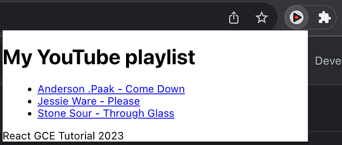
We can now give it a try! Run yarn build > Refresh code in the extension > Try it out!
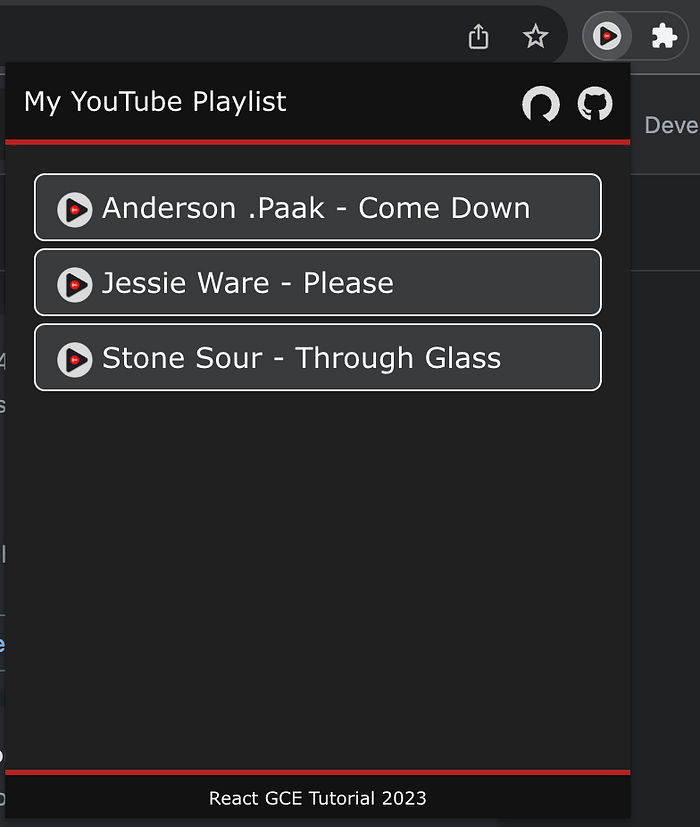
It looks better now! 🙃
Current code:
In the part II of this article, we will add logic into the GCE, allowing the user to add YouTube videos into it, in the corresponding YouTube video page — get ready for it! 👋

